The ImageList class has several built-in styles that how the items are displayed in the list. These styles are contained in the ImageListViewStyle enumeration which is used with the ImageList.ViewStyle property.
The following figures show examples of the default styles. Each is followed by a list of properties that control specific aspects of each view style.
Normal View StyleImage list items are framed; selected items display a different background color. Text is optional. To use this style, set the ImageList.ViewStyle property of the ImageList class to ImageListViewStyle.Normal.
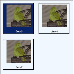 Normal View Display Variables
| 1 | ImageList.ItemSize. Sets the height and width of the entire item. |
| 2 | ImageList.ItemImageSize. Sets the height and width of the image itself. |
| 3 | ImageList.ItemForeColor. Used to draw the text of un-selected items |
| 4 | ImageList.ItemBackColor. Used to fill the background of un-selected items |
| 5 | ImageList.ItemSelectedForeColor. Used to draw the text of selected items |
| 6 | ImageList.ItemSelectedBackColor. Used to fill the background of selected items |
Items appear as buttons. Selected items appear as depressed buttons. Text is optional. To use this style, set the ImageList.ViewStyle property of the ImageList class to ImageListViewStyle.Button.
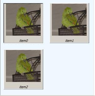 Button View Display Variables
| 1 | ImageList.ItemSize. Sets the height and width of the entire item. |
| 2 | ImageList.ItemImageSize. Sets the height and width of the image itself. |
| 3 | ImageList.ItemSpacingSize |
| 4 | ImageList.ItemForeColor. Used to draw the text of all items (selected and un-selected) |
The following are not used with ImageListViewStyle.Button:
ImageList.ItemImageBorderStyle ImageList.ItemBackColor ImageList.ItemSelectedForeColor ImageList.ItemSelectedBackColor
Items "float" on page background, with no frame or background border. Selected items appear framed, with text highlighted. Text is optional. To use this style, set the ImageList.ViewStyle property of the ImageList class to ImageListViewStyle.Explorer.
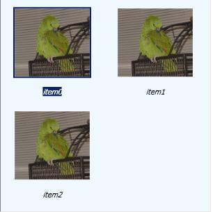 Explorer View Display
Variables
Explorer View Display
Variables
| 1 | ImageList.ItemSize. Sets the height and width of the entire item. |
| 2 | ImageList.ImageSize. Sets the height and width of the image itself. |
| 3 | ImageList.ItemMargin |
| 4 | ImageList.ItemForeground. Used to draw the text of un-selected items |
| 5 | ImageList.ItemSelectedForeground. Used to draw the text of selected items as well as a rectangle around the image of selected items |
| 6 | ImageList.ItemSelectedBackground. When an item is selected, this color is used to fill the background behind the text of the item and to draw a rectangle around the image |
The following are not used with ImageListViewStyle.Explorer:
Owner-Draw View StyleUse the owner-draw view style by setting the ImageList.ViewStyle property of the ImageList class to ImageListViewStyle.OwnerDraw.
In owner-draw mode, the user can create a template using OwnerDrawStyleKey view style mode.